|
|
Before, Vecka only gave the current week, but its update has improved it no end so that it may now be used to search for any week. Using "search" brings up the familiar selector wheels with month and date and these are moved around: Vecka then displays the week. As this has increased its usefulness by several factors, its elevation to a 99 cent paid app is neither a surprise nor excessive greed. A comment on the app, Evernote, which I enthused about in the previous Diary page on apps, "Half a Dozen More from the App Store". I had been trying this out at home and, despite reading the description online, had not realised that this was an app that only works at its fullest when online. On the iPod touch we can create text notes or saved photo notes (the iPhone also has voice notes and snapshot notes). These are put into a pending area. Once online, these are available on the device and the web page, but we can only read them on the touch if we are online. That seems to me a restriction that limits the usefulness of the app (and hence the iPod touch). I would like to see the apps saved in an offline form as well. I still like Evernote, but it could do much more. Cube Runner had an update recently. This was one of the first apps I downloaded It is still as frustrating as before. That is a compliment to the way that, sooner or later, I am caught out and crash. There are some nice changes. For example, there is now the addition of a horizontal mode as well as a number of other settings that are available via a button on the initial screen. On the screen that appears there is another Settings button which accesses calibration, a screen for sounds, music and vibration (all are off by default) and a button to turn Developer Mode on which turns of collision detection and is for level developers.
A simple new app is Newton's Cradle that, like the executive toy on the desk, has a series of five balls that can be set into motion and are then affected by touching one or more.
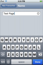
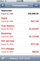
This free app starts with a basic screen on which to enter a title or description of a transaction and other data such as the amount. Selecting the relevant item brings up the keyboard with which to complete the data. We must remember when the data entries are complete, to press the Save button at the top of the screen. The alternative is cancel. On the main screen there is also an Edit button, similar to that in the Mail app that allows deletion of one or all of the entries. This would enable one to start a whole transaction set again, but it might be nice if a new page could be added.
Balance did not sync the first time I downloaded, but I tried again almost immediately and on it went. I have found a couple of the apps have not behaved perfectly in this way, but always a subsequent sync did the trick. With a few days since my check arrived I have been able to track the pace of spending and thus understand more of where it all goes. As I had some questions, I wrote to the developer, Connor Wakamo, and had quick and useful responses that answered my queries. Users interested in such software on the iPhone and the touch, might also look at Ledger a $3.99 app that covers more than the simple (but useful) transactions of Balance.
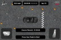
Audi of America now has a driving game the Audi A4 Driving Challenge which both tests the skills of the user and links the product -- their car -- to the user, at least in the mind: a subliminal tie-in which could affect future sales with the familiarity. Ever notice for example the number of cars of a particular model that you see on the roads after you have bought one? As a confirmation, the link from the iTunes shop is to an A4 advertising video. This is not a bad thing, if companies want to provide games like this as a new form of advertising, then users like me will benefit; however, other developers who depend on income from sales, may suffer slightly.
Like a lot of games, such as Cube Runner, we steer using the accelerometer and by tipping the iPod touch or iPhone to left or right. The object is to complete three laps of a course in a timed trial. There are five courses each progressively more difficult. I think it must be me as anything of this nature, that requires such coordination has me beat. Several years ago I was a police officer in the UK and then I became a First Class driver, trained to drive at high speeds in relative safety; but when it comes to rapid reactions on a computer screen I am lost. This Audi game is sophisticated, well made and an impressive offering for a free app., but like Lander, a helicopter game I downloaded a couple of weeks ago, it is not something I am ever going to succeed at. The app is affected by the accelerometers, so turning the iPod touch on its side has the effect of tipping it all to one side and, if I move the touch about this also interferes with the motion. Touching the screen does have an effect and this gives a realistic demonstration of the real Newton's Cradle. There was no way to return to the initial screen other than returning to the Home screen and activating the icon.
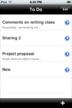
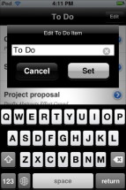
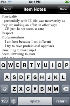
The first screen has two controls: Edit and + (add). Like Balance (above) and Mail, that Edit button puts a red icon beside the entry and enables us to delete after a confirmation. The + (add) button, of course, allows us to make another note. The panel that appears has some text and the X icon that enables easy clearing of the entry. A title for the note is then added with the keyboard that is also visble. Once the title is written there is either a Cancel or Set option.
Like Balance, there is an icon for To Do in the settings panel and this allows us to turn on (or off) a number feature. When ON, the number of live notes is displayed on the Home Screen icon, in the same way as Mail displays the number of new messages. Erica has a couple of other apps available. The first is a basic sound creating program for the iPhone -- the touch does not have internal speakers, but it will work with external ones -- that makes a MOO sound when turned upside down, like the toys that some of us may have had as kids. The other app. -- and all of hers thus far are free -- is called ad hoc Helper and is for those who may become involved with app development. Apple allows up to 100 people to work on such an app but the details of the iPod or iPhone need to be used. There is a process via iTunes to come up with the data, but Erica's app makes it just that bit easier if you are so involved in testing. We look forward to Erica's new book on developing apps for the iPhone (apparently on hold because of the Apple non-disclosure agreement) and hope that she also makes some more. There is another organiser of a similar type called To-Do (with a hyphen) and the screen shots show it may be a little more interesting and I will have alook at that in a while. This is another app that has the web link written wrongly in the iTunes store and the second one to send me to the Apache web page on my own Admin account (the index page at localhost). Fortunately Google came up with a proper link.
The app is in five sections: The Latest, All Shows, Couture, Style File Blog and Style Videos although at this stage not all are up and running. There is a muted bravo here as this gives a fair amount of time for the app -- a new form of publishing no less -- to have a wider circulation on the iPhones of the world; while there is also time for any errors to be corrected and updates released. The Chanel app still gives the location of the Bangkok Airport shop as a small soi in Samut Prakan near the Chao Phraya river.
The section marked Couture, however has what one might think of as an A to Z of fashion houses, although this is A to J plus V for Valentino. Tapping by any name in the list, Elie Saub for example, brings up a generous display of thumbnails which lead to full-screen shots and a slide show of the entire collection. All of the images are frontal shots. Access to these does require the user to be online. Turning my wifi Off, on the iPod touch, produced a blank page with each of the names. The following section, "Style File Blog" did not need the access at the time of reading as the items were obviously downloaded earlier when I was online and stored. I must admit that, with the world of fashion, the word, "Blog" seems to jar a bit: it is not a beautiful word although is accepted into the language.
WiFi connections presumably would not be a problem for owners of the iPhone who also have EDGE and 3G. Us poor folks in the back, with the iPod touch, and no iPhone in sight (in this part of S. E. Asia, where fashion does have high priorites), make-do. The final section was a collection of videos which were downloaded from an online source as I watched. The speed here depends on the collection and each time there was a pause owing to slow reception, I had to press the start button again. When enough data was downloaded, playing was smooth and of a good enough quality to enjoy sharp images on the touch screen. It was slow enough for me to become a little tedious. Sound quality via the iPod touch ear buds was fine. I checked the Style.com website and the Flash videos there were painfully slow to download and play. Opening a YouTube page gave me an almost instant download via Safari (slightly slower on the iPod). An interesting offer here from Style.Com with some minor improvements needed, some of which will come when that September date comes round: soon.
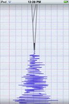
One of the early downloads of Apps that I looked at was one called Level which was produced a basic spirit level function using the accelerometers in the iPod touch. This was greatly improved with the first update that added calibration and a couple of extra tools. Another app that makes use of the accelerometers is Seismometer which, as the name suggests, displays vibration information in much the same was as the device for recording earthquakes does. There are a couple of differences between this simulated graph and pen on the screen and the real thing: there are no units on the page (either time or Richter scale), nor is it possible to save data other than as a screen shot. Of course, this is not pushed as a serious scientific device by the Swedish developer who is producing this, Coneri. Their web page is in Swedish only althogh there is a link to the Google "translate" service which brings up a reasonably understandable rendering of the information. As it stands, Seismometer is an interesting niche app which simply confirms that the trucks that pass near my house shake the foundations and the walls more than I want.

We have a mix of apps that are useful and informative.
Half a Dozen More from the App Store Seven More from the App Store |
|

 As seems to be the norm, a number of apps have been updated including that single-use Vecka I wrote about in