|
By Graham K. Rogers

Over the last couple of days, I wrote a couple of online articles concerning the F1 Timing app that this year is not put out by Soft-Pauer but has been taken over by Formula One Management. For some reason, the app was not available in a number of countries. There was no reply to an email I sent, so when information on Twitter started appearing on Friday morning as the first practice got under way at Melbourne for the Australian GP, I left two or three acid replies.
By some coincidence, at 11:45 am, just before lunch, a Tweet appeared that told me the app was now available in more countries, including South Africa, Indonesia and Thailand. Although a search in the App Store was not successful (it is now) I linked to the app via the F1 site and downloaded it.
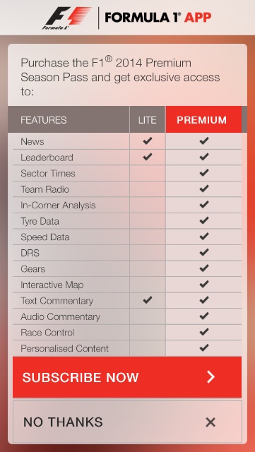
This year, the Official F1 App is free. However, to use any data does need an in-app purchase of $10.99. As the Timing apps over the last couple of years have cost more than that, this was not a burden.
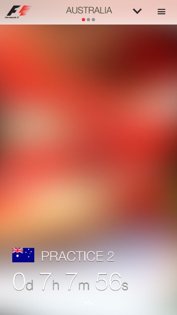
It is immediately clear that the interface has been redesigned. When I opened the app, there was a blurred background image with bare details of the current race and the time to the next event (Practice 2). The font chosen is thinner and easy to read. Scrolling left gave me a link to the Friday press conference, with images and a transcript of the event. Scrolling again opened a page of (18) drivers. There are fully 22 listed this year. Had I wanted, I was able to add a favourite. This would provide a feed of news and other media about that driver.
Navigation is via icons at the top of the screen. A down arrow reveals the races and a user is able to scroll horizontally through the list. Each has the country flag, the name, along with the dates of the race weekend. Below are the times. The default was for the race time, but a tap on the screen at the bottom allows these to be converted to local times.
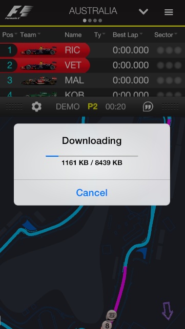
The times have an additional function, allowing the user to access the timing screens for a running event, or download the data. When I tapped the icon for Practice 2 at Melbourne, I was invited to subscribe: $10.99. Once done, the data began to download. Don't switch apps when a data download is taking place as this will interrupt the data flow and it will need to be started again.
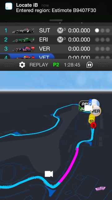
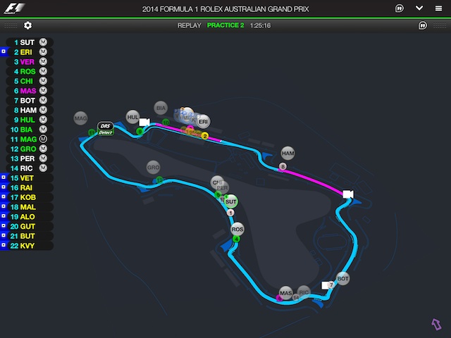
As in the previous app, the timing display shows a diagram of the track with cars on it (when running), or a full screen display of timing with four optional screens (Leaderboard, Tyres, Best Sectors and Live Standings). Or both: the twin timing-map display on the iPhone is a bit small of course. Timing screens are clear. The circuit diagram has been redesigned and the different track sections are clear to see.
To the right of the down arrow at the top of the screen is a menu icon. This reveals ten options.
- ABC at the top shows or hides menu descriptions
- A Radio button takes the user back to the main screen (top level)
- The stopwatch opens timing/circuit screens
- An icon with speech marks in a balloon links to live commentary (not available when I tried)
- A cube icon (actually a circuit representation) reveals four sub menus -
- Circuits, dates and events (Practice, qualifying, race)
- Drivers' championship standings
- Constructors championship standings
- Driver pole positions (new contest this year)
- R19 lists all races. Tapping on a race panel reveals more data about the race
- A helmet icon lists the 22 drivers and their competitor numbers. Tapping on a panel reveals more information about the driver
- What appears to be a headphones icon lists the 11 teams. As above, tapping on the panel gives the user more information about car, team and drivers
- The shopping trolley allows in-app purchase of the Season Pass
- Settings allows a number of changes to the display and the way the app behaves.
Although this is an early look (later than some of course) the app appears to be well designed, and the data - several different types of information are included - is handled quite well. The design looks clear and easy on the eyes. My initial download of Practice 2 went smoothly (apart from when I switched apps - my fault) and the information concerning driver times and track progress was delivered to the screen smoothly.
Although I tried it first on the iPhone, I am more likely to use this app on the iPad, when I am watching the race on TV (cable company willing, of course). As with the iPhone, once I had Restored Purchases (rather than paying twice), there was a download of "Core Updates" which took a few minutes.
The app is optimised for iPhone and iPad, so displays full screen on the larger device. The display on the iPhone was clear enough, but on the iPad it is much better and not only because of the screen size. There are also some differences.
One example concerns the timing screens. There are four on the iPhone, but six on the iPad: Leaderboard, Tyres, Live Standings, Best Sectors, Gap/Interval, "Page 1". Page 1 and Gap/Interval are in a different font and the display is more basic.
What we need now is for the racing to begin.
Graham K. Rogers teaches at the Faculty of Engineering, Mahidol University in Thailand where he is also Assistant Dean. He wrote in the Bangkok Post, Database supplement on IT subjects. For the last seven years of Database he wrote a column on Apple and Macs.
|