Cassandra: Care and Detail in iOS 7 - The Clock
AMITIAE - Sunday 8 December 2013
|
Cassandra: Care and Detail in iOS 7 - The Clock |
|
|
|
By Graham K. Rogers
Ive of course is known to have had a big influence on the interface design of iOS 7. It is an exercise in simplicity (over-simple some say), with some interesting surprises concerning detail. While examining the System Preferences for OS X 10.9, Mavericks recently I used the system icons for many of the pages. Although these only appear as tiny images, the files are quite large: indeed there are two files, and one is a TIFF image of 4 MB. All that for a tiny image.
Here's to the crazy ones. The misfits. The rebels. The troublemakers. The round pegs in the square holes. The ones who see things differently. They're not fond of rules. And they have no respect for the status quo. You can praise them, disagree with them, glorify or vilify them. About the only thing you can't do is ignore them. Because they change things. Likewise on that icon for Print, there is a significant section of text (Lorem ipsum. . .) coming out of a printer and displayed upside down. Other icons are similarly detailed. Design guru, Ludwig Mies van der Rohe, once said, "God is in the details."
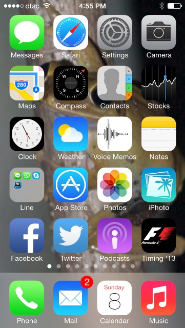
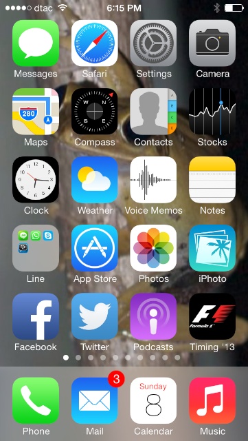
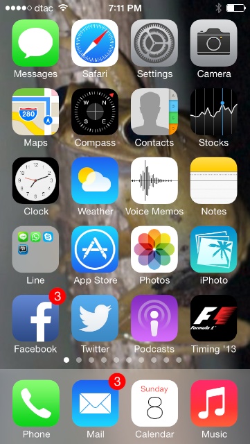
Home Screen and clock icon at different times
I did of course have a close look, for example at the Compass app, which points always in the same direction. I also checked the Apple apps that I have, like Stocks and Weather. These do not change. The Clock icon is unique in this unusual detail rendering of the exact time of the day. This also occurs on the iPad and on the iPhone 5c: a unique effect in iOS 7.
Graham K. Rogers teaches at the Faculty of Engineering, Mahidol University in Thailand where he is also Assistant Dean. He wrote in the Bangkok Post, Database supplement on IT subjects. For the last seven years of Database he wrote a column on Apple and Macs. |
|

For further information, e-mail to

|

|


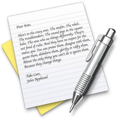 But then, as I saw yesterday when looking again at TextEdit, the icon for this (and for Print preferences) carries a wealth of information. The TextEdit icon carries half of the complete text of, "Here's to the crazy ones".