AMITIAE - Saturday 29 June 2013


Another Excellent iOS Photography App: 645 PRO Mk II from Michael Hardaker

apple and chopsticks


advertisement


By Graham K. Rogers


645


Although I have quite a mixed selection of apps for my iOS devices, most of my focus has been on the iPhone camera and apps that make the most of this feature. It is probably not a coincidence, but some developers produce good apps over and over again.


One of these developers is Michael Hardaker. I first came across his work with the two apps named 6x6 and 6x7, which seek to emulate output from medium format cameras. More recently I was impressed with PureShot which was the first app I had seen that was capabale of producing uncompressed TIFF output: each file from the iPhone being around 17 MB instead of the usual 2 MB or so for the iPhone JPG photographs. Output from the iPad was slightly smaller at around 14 MB

A nice point about PureShot was the user interface which looked like a camera, with a number of buttons just like on the real device. There were also several software controls making this a useful tool for some photography.

One of the other apps from this developer is 645 PRO Mk II which has recently been updated. The app is priced at $3.99. I showed this to a collegaue, who is a diehard analog Leica user and he was quite taken by the interface of this app which build on the interface of PureShot. When I showed him some of the other features, he looked thoughtful: he is an owner of an iPhone which he only uses for calls; and (as per above) does not even use a digital camera. Not yet.

Like the earlier 6x7 and 6x6 this app takes the design concept from medium format cameras. The particular reference here is to the aspect ratio of 6 x 4.5 cms such as used by Mamiya, although the camera is not limited just to this (unlike the 6x6 and 6x7 apps). 645 PRO Mk II also has a number of such options; and more besides.
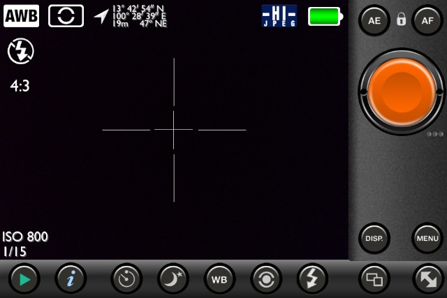

PureShot
iPhone Display: PureShot


645
iPhone Display: 645


The app opens directly into the camera-style interface which is a little busy. One of the controls allows the user to adjust the amount of information displayed onscreen from full bells and whistles to nothing. I would suggest working through the controls and menus before simply starting to take photographs: a number of specialist settings are not available by default and the process of discovering these allows the user to learn about what is available.

To the right of the screen (the app only displays in landscape mode) above the aluminium-finish shutter button are lock buttons for white balance (WB), automatic exposure (AE) and Autofocus (AF). Below the shutter button are three controls that add much to the value of this app:


Aspect Ratio

The app takes its name from the 645 medium format, but the icon just below the shutter allows the user to select from another 7 from a carousel, including the 6x6 and 6x7, as well as the unusual 6x17 format, giving a very wide angle shot.
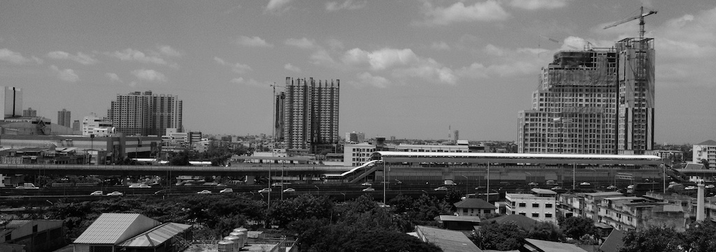

645


This produced an image of 3264 x 1152 and when exported from Aperture as a 16-bit color TIFF image gave me a file of 22.6 MB. In Graphic Converter this was displayed as a photograph 45" x 16", albeit a little grainy viewed close-up. In monochrome the file was shown as some 10.8 MB.


Film Types

Just below and a bit to the left of Aspect Ratio is a button that displays a carousel with a selection of film types. Among these were K25 (Kodachrome 25), F4 (which appears to be Ilford FP4) and E64 (Kodak Ektachrome): 9 in all, plus three marked C-1, C-2 and C-3.
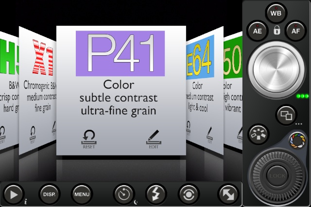
645


645


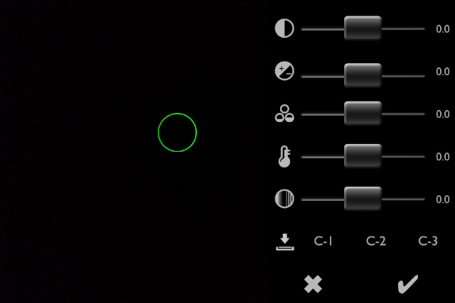
The film types can be selected with a tap, but on each of the film panels are a number of features: most have Edit and Reset options, so specific changes may be made to a film's settings, for example contrast or temperature. These may be saved to the film type or to one of the files: C-1, C-2 or C-3. This gives a photographer a specific settings blend. These may also be re-edited, including the selection of a different film type.


Filters

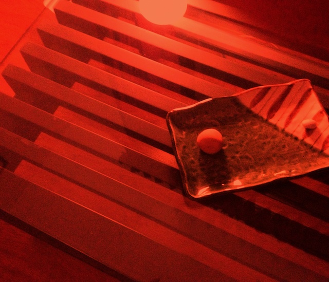
The carousel display is also used in the selection of filters. These actually look like filters too. There are 11 (plus a "no filter" option). Adding to the cleverness of the app, connected to the filter selector icon is a wheel that allows the user to increase the effect of the filter, from 0 to 100%. The level can be adjusted while shooting.
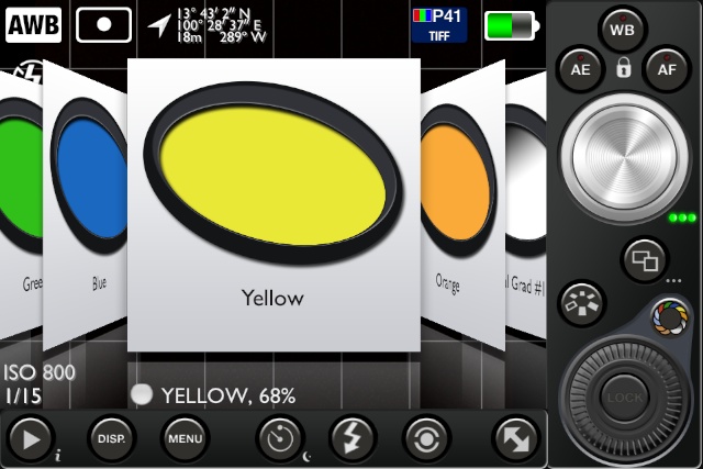
645


645
Red filter at 100%


To see the effects as they will be applied, the camera must be set for Live Film Mode preview (in the Viewfinder menu). This was the default for both the iPhone and iPad, but the screen display reacted more slowly on the iPad.

As I panned with the device, so the onscreen dispaly was blurred and refreshed slowly, like a slowmo movie. Once the iPad stopped, focus returned to the screen image, with a small delay. Doing this on the iPhone 4S that is my current device, produced no blurring. This had no effect on photographs taken.


Other Controls

At the bottom of the screen are a number of controls:

  • An arrow icon at the extreme left of the screen is shown when the camera is used. This opens the Photo Album so a user may scroll through (and select) images for exporting by mail or to sites like Facebook or via Twitter. Images may also be opened in other apps.

  • An icon marke "DISP." allows the user to toggle through different screen displays: data on/off, grid lines with data, grid lines without data, nothing.

  • The Menu reveals several ways to adjust settings in the app via menus for:
    • Viewfinder
    • Saving
    • Shutter release
    • Focus & exposure
    • Low light
    • Artist & copyright
    • Advanced
    • User guide
    • About

    All except the User guide have sub-menus allowing the app settings to be fine-tuned to an unusual degree. The User guide is a 48 page document that describes the use of the app in some detail. As with PureShot, this is available for download.

  • The Self Timer button turns the timer on (or off). The default setting is 10 seconds, but this may be changed in the menu.

  • A Flash icon turns flash on to Automatic or "Force On" and "Force Off".

  • A Metering icon toggles between Spot metering or Multi-zone. When Spot is selected, a green circle appears onscreen. This may be dragged to a suitable position.

  • A double-arrow icon at the far right, reduces the amount of information onscreen by hiding the bottom section and showing only shutter, plus AF, AE and WB buttons on the right along with the double arrow to show the full display.


The 645 PRO Mk II app from Michael Hardaker is another example of really well-thought out photography software that brings an increased sophistication to the output from the iPhone and iPad. At $3.99 it is not too expensive, especially considering the amount of effort that has clearly gone into its development.

Like other output from this developer, 645 PRO Mk II is highly recommended.


Graham K. Rogers teaches at the Faculty of Engineering, Mahidol University in Thailand where he is also Assistant Dean. He wrote in the Bangkok Post, Database supplement on IT subjects. For the last seven years of Database he wrote a column on Apple and Macs.


advertisement


Google


Made on Mac

For further information, e-mail to

information Tag information Tag

Back to eXtensions
Back to Home Page