PureShot: A Higher Level iOS app from Michael Hardaker for the More Serious Photographer (Amended)
AMITIAE - Sunday 19 May 2013
|
PureShot: A Higher Level iOS app from Michael Hardaker for the More Serious Photographer (Amended) |
 |
|
|
By Graham K. Rogers
BackgroundWhen the iPhone first appeared its camera was, by today's smartphone standards, not that good. For photographing people at a party, or a wide vista, it was OK. Nothing more: OK. As the different generations of the iPhone (and other smartphones) have appeared, so the camera quality has improved. A recent article by Lisa Bettany of Camera+ compares the output from all iPhones: iPhone, 3G, 3GS, 4, 4S and iPhone 5.Anecdotally, a look at the crowds in any public place will show that more people are taking pictures with an iPhone, or an Android device, or even an iPad. There are always shrieks of horror at the idea of the iPad used as a camera, but like it or not, this (along with the iPhone) is what people use. Apple was able to publicise use of iPhones for taking pictures with a one-minute advertisement that has a single line of dialogue: "Every day, more photos are taken with the iPhone than any other camera." One of the attractions, apart from the ease of use, is the number of apps that are available for the iPhone (and iPad) that allow editing from a simple change of brightness up to complex filters, making it effortless for ordinary users to make changes to their images that a few years back might have needed a complex professional application on a PC or Mac.
The developer, Michael Hardaker, whose excellent 6 x 6 and 6 x 7 apps are already favourites of mine, explains that "The term 'developed RAW' - dRAW - is used to describe a TIFF image that has had no in-app post-processing applied and, critically, no JPEG compression at any stage." This lack of compression is valuable in preserving an image (and its integrity) for post-processing and for further use.
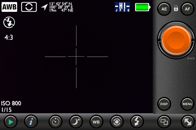
iPhone Display
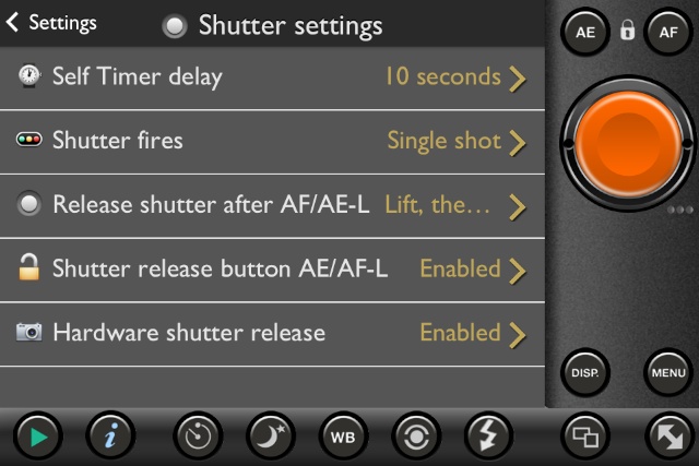
PureShotWhen opened, the app display looks like the back screen of a camera, with a number of controls at the bottom and one side (depending on how the iPhone is held). On the main image view screen are several data displays, such as white balance, location, and image type. These may be turned off (or on) using the extensive menu system accessed via a button below the larger orange shutter button. One of the many items in the menus available is the ability to include a copyright notice with an image.
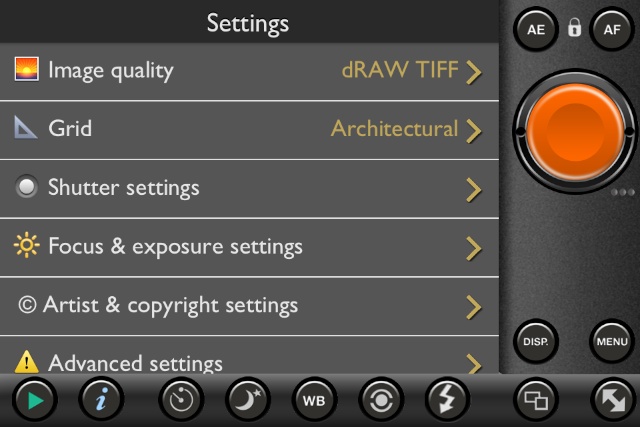
There are nine (9) buttons at the bottom of the display. From left to right these are:
The full use of the buttons and the menu system means that the app and its output is highly configurable.
OutputAlthough the default was for JPEG images to be saved, I changed the setting for quality to use the dRAW TIFF format for images. On occasions, writing one of these larger images to the album was slightly delayed. While the default size of a photograph taken in the standard 4:3 display was the same at 3264 x 2448 (8MP) with the iPhone 4S, the image size was much larger at 22.86 MB.As a comparison, my Nikon D7000 produces RAW images of 16.1 MP (4928 x 3264) with a file size of 18 - 19 MB. The image sensor of the Nikon is about 3 times the size of that in the iPhone (see Simon Crisp on Gizmag for an explanation of the differences). When I used the square (1:1) aspect ratio, the image size was of course smaller at 2448 x 2448 (6 MP) and a file size of 17.15 MB. I also tried the app on the iPad. The display is full screen and almost identical to the display on the iPhone, although the larger screen area gives a cleaner display of controls. Images output from the iPad in PureShot in the dRAW TIFF format were 2592 x 2396 (5.0 MP) with a file size of 14.36 MB.
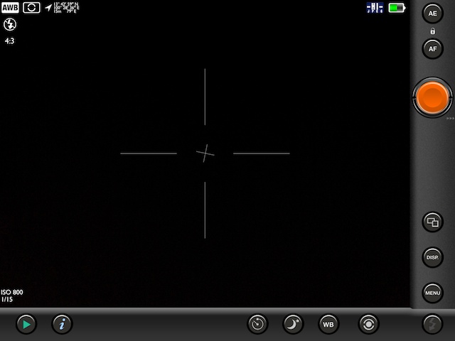
iPad Display
I opened these in GraphicConverter and saw that an image was shown as 45.333" x 34" at 72 pixels/inch. I adjusted the size and resolution. With no apparent loss to the image, was able easily to produce an image 15" x 11.25" with a resolution of 210 pixels/inch: a higher value useful when printing pictures.
CommentsThe prig who insists that no one can take a proper picture with a smartphone is blinkered and old-fashioned. Many happy consumers take rather good photographs with the cameras (or smartphones) they carry about with them, with more and more appearing not just on social networking sites, but also in other media. The best camera is the one that's with you (Chase Jarvis).As a useful additional reference, you might find the ideas that Lexy Savvides covers in an article that appeared coincidentally a few hours after this first appeared.
I mentioned above the apps 6 x 6 and 6 x 7 which were attempts to bring medium format output styles to the iPhone (my favourite of those is 6 x 7). PureShot is another bridge between the traditional and the modern. With an expected resolution increase for the next iPhone (perhaps to 12 MP) this is a good way to start experiencing better output from a smartphone camera.
Graham K. Rogers teaches at the Faculty of Engineering, Mahidol University in Thailand where he is also Assistant Dean. He wrote in the Bangkok Post, Database supplement on IT subjects. For the last seven years of Database he wrote a column on Apple and Macs. |
|

For further information, e-mail to
|
|