Another 24 hours with iPhoto for iOS: Discoveries, Clarifications and Corrections (Amended)
AMITIAE - Saturday 10 March 2012
|
Another 24 hours with iPhoto for iOS: Discoveries, Clarifications and Corrections (Amended) |
|
|
|
By Graham K. Rogers
I cannot recommend the demonstration from Randy Ubillos enough as the confident way he handled the app -- borne of familiarity of course -- is clear evidence of how strong the basis of iPhoto is. There are text outlines of the features on the Apple site, but this needs a demo video to be provided online. There are links to the Keynote presentation. The iPhoto demonstration starts at 1:03:45 and runs for just over 10 minutes.
Installation on the iPhoneThe interfacing of iPhoto on the iPhone and the iPad are really quite pleasing to the eye: a subjective judgement of course, but just this view of shelves with photo albums -- eye candy for sure -- is nice to look at. Compared with some of the unattractive interfacing on some platforms, especially in the past, I am pleased that someone is taking the time to think about the user.The albums are in three colours depending on the source of the images. Five tool icons are at the bottom of the main screen: Albums, Photos (all of them), Events, Journals and Settings.
EditingI had earlier found the interfacing as concerns tools and other icons mixed and confusing. I still think there is room for improvement.
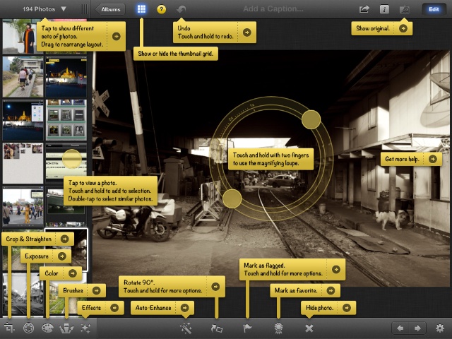
My main problem with the editing tools on the iPhone was the lack of an obvious Undo tool (clear on the iPad). Using several effects on one image I ended up with a black screen, although the View Original icon showed me the image was not lost. I just was not being allowed to see it. This was so in the Edited Album and also in the original source album which was unexpected as editing is non-destructive: an edited copy should be saved, the original is not changed. The trick on the iPhone was to access the toolbox and each of the effects one by one. Using the Options panel has a Reset button and that took me back to zero for each of the tools applied. It was a bit long-winded and not immediately obvious. It probably is when you think about it, and I will never need to think about it from now, but initially it did not scream out at me like some controls do. And should.
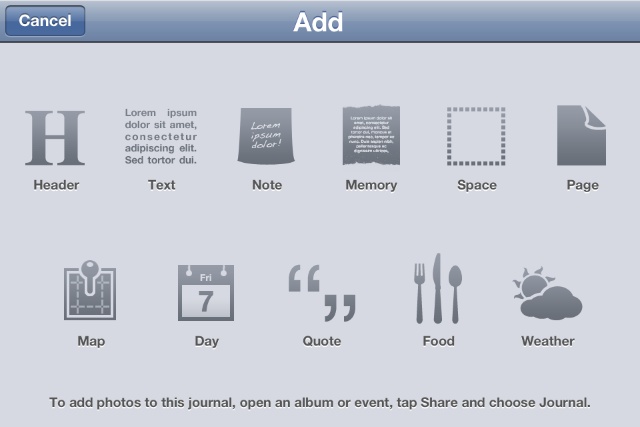
JournalsI had already played with the Journals section, finding it an easy task to upload a few images to iCloud, and I returned to the page I had created in the morning, to add another 25. While waiting for these to upload, refreshing the browser page gave me an "Unavailable" message on a yellow sticker like we see when the Apple Online Store is being updated.The video demonstration also showed me how simple it was, using an "Add" panel in Edit mode, to add a map or a calendar entry to a journal page, taking metadata from photographs. There was also text entry boxes, Weather, Food and others. These would give a page far more character and meaning than a display of photographs with captions.
After editing in Aperture and a slow transfer to Photo Stream, the selected images were available to me in iPhoto on the iPhone. As before, I selected those images I wanted, pressed the Share and then the Journal buttons, adding and reordering the images quite swiftly. After the process of uploading, the URL was available to me. With this sort of feature and the others (like Photo Stream), it does not matter who produces the browser if you own the web.

Installation on the iPadThe size of the iPad screen makes a difference just because it is easier to handle the larger device. The tools are easier to access (they are displayed differently) and there is less retrying an effect, which happened to me often with the iPhone. Nonetheless at the moment it is the iPhone that I am more likely to have with me at any time. I always take the view that the iPad is for when I am sitting down with some time on my hands. The iPhone is the immediate device, and the first editing I tried with iPhoto was in the back of a taxi to that friend's graduation.
CommentsThe interface is an example of Apple's best work. It felt initially as if several individuals were responsible for different parts. That feeling has begun to diminish with the little familiarity I now have, but as my biggest strides were made after seeing the demo, it would serve Apple well to provide clear video instructions online -- people learn more easily from seeing a process than reading about it. As a local note, many of the photographs Randy Ubillos used for the demonstration came from a trip to Thailand.Use of the Journal features within iPhoto will make a difference to the way ordinary users can share images and communicate ideas quite quickly when away from home. While I did most of the work using wifi, it should also be possible with carrier signals in many areas to work with 3G. The Journals feature with iCloud is far simpler than iWeb on Mobile Me. I will take advantage of this ease of use. Learning the effects and the tools behind each of the icons will not take more than a few days. I have seen some of those icons in Aperture (e.g. Crop). From the point of view of new users, information about the function of each tool or icon via a text popup would be helpful .
Graham K. Rogers teaches at the Faculty of Engineering, Mahidol University in Thailand. He wrote in the Bangkok Post, Database supplement on IT subjects. For the last seven years of Database he wrote a column on Apple and Macs. |
|

For further information, e-mail to

|

|