A Poorly Developed App with Inadequate Content: TouristBuddy, from the Thai Tourist Police

AMITIAE - Wednesday 3 April 2013
|
A Poorly Developed App with Inadequate Content: TouristBuddy, from the Thai Tourist Police |
|
|
|
By Graham K. Rogers
I had some more thoughts about this and decided I would write a longer review to qualify my initial impressions.
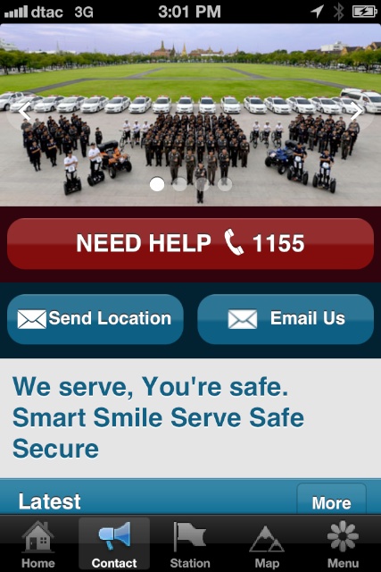
The app as it appears on the iPhone is not the same as is shown in the iTunes app store. Instead there are three logos and a center emblem as well as the Eng/Thai button which ruins any pretence to design. Perhaps this is a pointer to interference that may have occurred while the app was under development with the additional badges - making sure all agencies are represented - added after the screen shots were submitted as part of the approval process. That Tourist Police badge is smart enough on its own. Also on the main screen was the Tourist Police name with a useful phone number (1155) written twice, more slogans; then dead email and URL links for the organisation. At the bottom of the page are 5 icons that link to other parts of the app: Home, Contact, Station, Map and Menu.
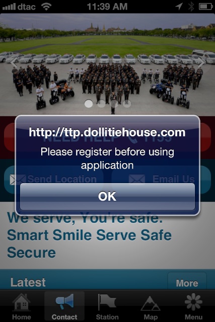
ContactAs with every section, the moment a user accesses this section a warning appears "Please register before using application" but when OK is pressed, nothing happens. There is a registration feature in the App. However, that is not revealed until the Menu section (the last icon) is accessed and there is no information about this before. Instead the URL of the website keeps appearing with no live link.I tried the site that was indicated in a browser. It took a long time to load but it is a half-hearted effort with poorly focused images at too low a resolution and nowhere obvious that one would want to register. I accessed the site using a browser on my Mac and the opening page begins, "Welcome. Good news, everyone! Thailand Tourist Police Introduction message." And this sets the scene for the rest. It does get worse and almost the whole site consists of placeholder text, which is rather irresponsible if this is part of the strategy for protecting tourists. Only one section appears to be available for users to enter details, but in its current state it is not clear how effective this will be. The app itself - if it is anything more than a back-patting exercise - needs to have registration incorporated when first opened. Other apps have succeeded in doing this effectively for a number of years now.
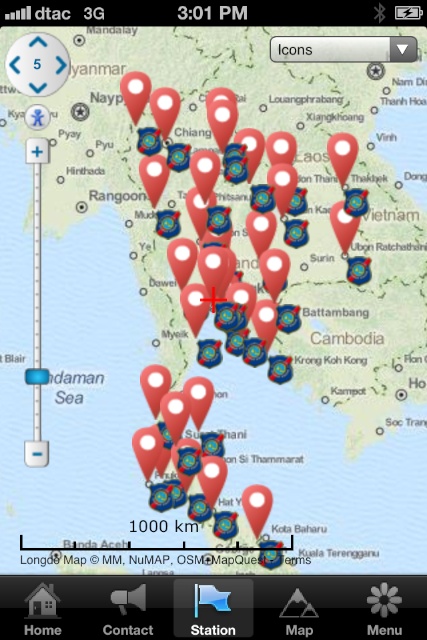
StationPeessing this icon reveals an out of focus Longdo map of the region that has so many pins, so close together that it is difficult to make out some of the individual locations. When brought to a reasonable zoom level - heavens this was slow loading - it was possible to make out some information more easily. Pressing on a pin brought up a useful text box of the location, address and a link to the phone number. Pressing that asked the user to confirm that a call was to be placed.
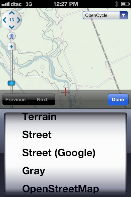
MapThis section almost duplicated the Stations section so there may be an argument for combining these (too simple of course). Instead of station pins, the map focussed on my location and the pins available showed areas that might be of interest to tourists.
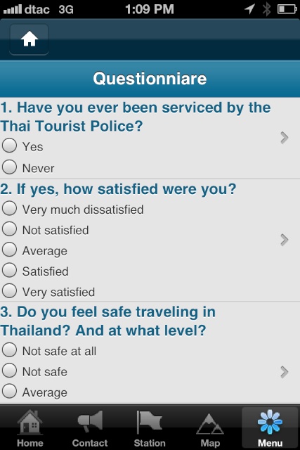
MenuThis is in 7 sections beginning with the Registration. That should have been available at startup not hidden within the depths of the app. Putting it here shows how the needs of the user are not really paramount. There is a Back button (marked with a House icon), but pressing the Menu icon again does not work.Other sections include
CommentsThere are several things at play here. Tourism is a major industry in Thailand and with a recent spate of attacks, on tourists, particularly in Phuket, the government needs to be seen to be doing something. The first contact point for may tourists in trouble is the police and Thailand has its own Tourist Police: the officers are available (in theory) to help tourists. An obvious extension of that is the app as many tourists will presumably have smartphones.Theory is one thing; execution is another. It looks as if TouristBuddy has been created in a rush with incomplete links (especially that website) and much information that should be for tourists is in Thai - utterly useless for those who do not read the language: tourists. Why wasn't anyone competent asked to look over the English content? Like the content of many websites here, it looks as if the bosses have made a decision to go with an app and given a command from on high. On the way, not enough attention has been paid to what is truly needed, other than making the bosses look good. TouristBuddy does not work well, it looks amateur, it has suspect links and is under-developed. Into the trash with this.
Graham K. Rogers teaches at the Faculty of Engineering, Mahidol University in Thailand. He wrote in the Bangkok Post, Database supplement on IT subjects. For the last seven years of Database he wrote a column on Apple and Macs. |
|

For further information, e-mail to

|

|

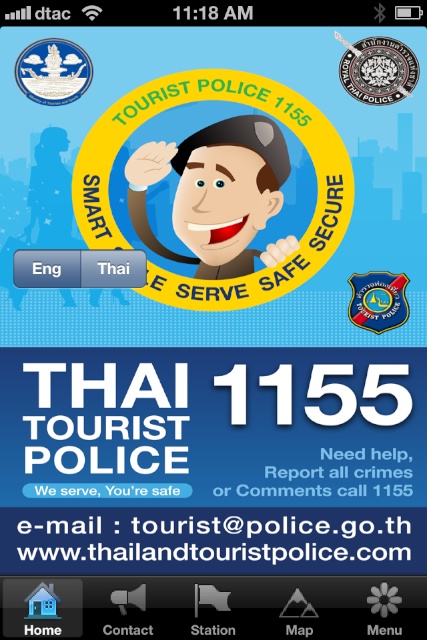 The app opens with a juvenile cartoon representation of a smiling Thai Tourist policeman. As with so many design exercises here, this opening page is overkill: there is just too much information as everything must be shown.