Carat: UC Berkeley AMP Lab app for iOS Battery Analysis
AMITIAE - Sunday 8 July 2012
|
Carat: UC Berkeley AMP Lab app for iOS Battery Analysis |
|
|
|
By Graham K. Rogers
For those who use the iPhone, the way that the indicator drops -- all too quickly with some apps -- can be a source of annoyance, particularly if some important tasks need to be done. In casual use it is clear that sometimes the battery is depleted faster than at other times, even if Apple's advice about turning off certain functions is followed. That may not always be convenient. The AMP Lab at UC Berkeley (Algorithms, Machines and People) has released an iOS app, with the lovely name Carat and an icon that uses a carrot (a visual pun on the name). The app examines battery use as part of an ongoing research project. CARAT is part of the Collaborative Energy Bug Detection project and there are versions for iOS and Android.
There are 5 sections to the app, accessed via icons (with text) at the bottom of the screen.
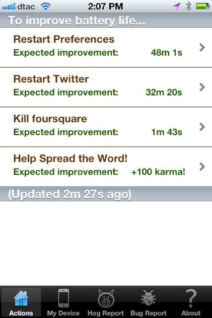
ActionsInitially the section marked Actions had a limited amount of information. The screen was in two sections with the first indicating ways to improve battery life. Below this is a bar with the last update time shown. At first there was only a "Help Spread the Word" link that would enable the user to inform others about the app via Twitter, Facebook and other links.As the data was collected (see Hog Report, below) so suggestions as to apps that should be restarted or killed appeared. As these actions were taken, so the list items were deleted.
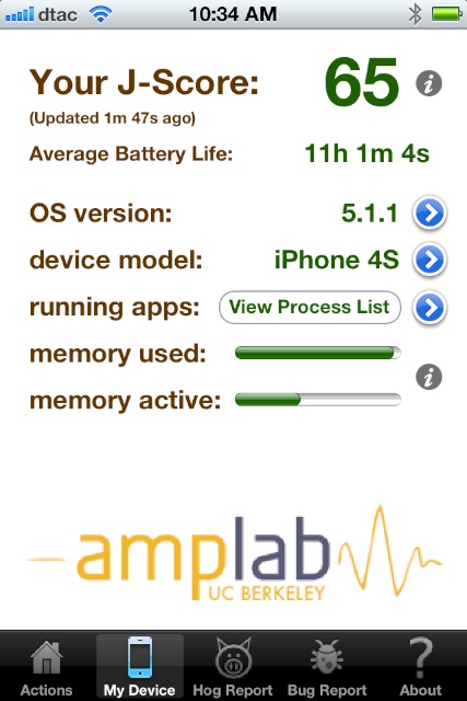
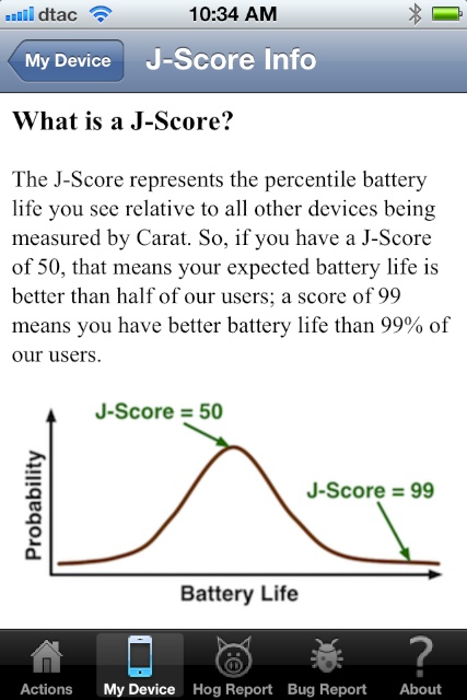
My DeviceThe information concerning the device (iPhone or iPad) is shown in the "My Device" panel, which has a prominent number -- The J-Score -- displayed at the top with "Average battery life" shown just below. This score changes as data is sent to and from the phone. Other information shown below is: OS version; device model; running apps; memory used; and memory active. The first three here have a blue arrow alongside allowing access to more information. Currently only the "device model" has any information and a graph is shown comparing the user's phone with other devices of the same model.The item marked running apps has a blue arrow which has no information (perhaps this is for a feature to be added in the future) but there is a button that reveals a list of apps that are currently running: View Process List. There are several processes active that a user may not recognise, such as kernel_task, notifyd and lockdownd. The process number is also given: this would be useful for analysis in some cases, but unlike OS X, there is nothing we may do with this. Perhaps it should be adjusted to show apps that are running, rather than processes, which might be more relevant to most users. Beside the last two items --memory used and memory active -- is an "i" for information that brings up a text explanation of the terms.
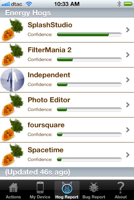
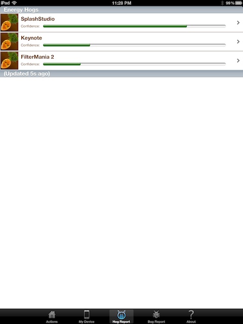
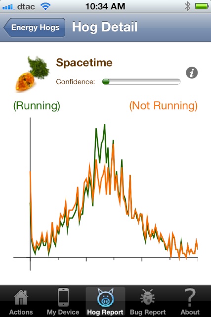
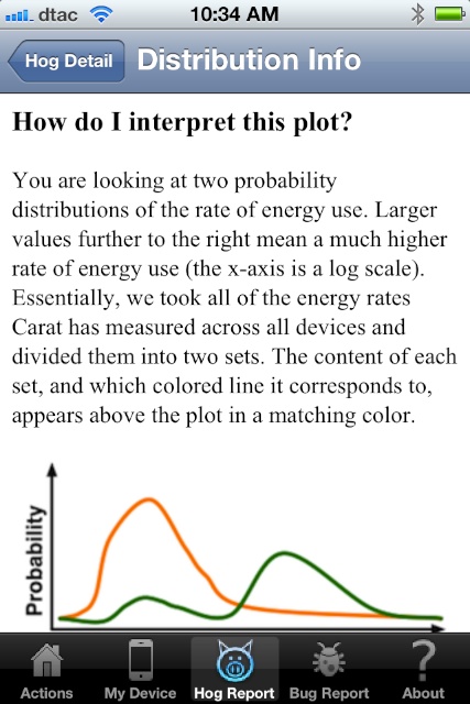
Hog ReportI initially thought the Hog Report was not working, although there was a clear indication that data was being collected. This is sent to Berkeley where it is analysed. Some people may not be happy with this and there were a number of negative comments on a forum that can be accessed from the app. Allowing access is for a user to decide and I tend to run project apps both from the point of wishing to support research and in the hope that such research will benefit me.I waited a week but still nothing had appeared. I was ready to dump the app, but held off a while longer. It took about 10 days for the first data to populate this section and it has been available since, except on one occasion at work when a power cut caused a wifi connection to fail. The iPhone switched to a router with no internet (don't ask) and zero data was displayed. Relinking to the original router brought the data display back. It is clear from this that data is being sent from the iPhone (or iPad) to Berkeley. Once analysed information is returned and the apps with problems about energy usage are shown. It is this analysis that is used to provide information in the Actions panel concerning those apps that ought to be killed or restarted. Touching an item in the list opens a Hog Detail panel with a graph showing how power is used. Each of the graph panels has a link to an information page that has a text explanation on how to interpret the plot of the graph.
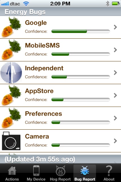
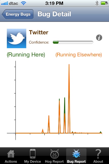
Bug ReportRelated to the Hog Report is the information contained in the Bug Report: slightly different of course. An app that uses much power may be working properly, while an app that has a bug may consume more power than it should.Like the Hog Report, each item in the list is linked to a Bug Detail graph that indicates how and when power is being used and the same text explanation of how to interpret the plot.
AboutThe final section contains information about the app and the project and has a brief explanation of each of the above sections. There are also four useful links: Carat Project Page; EULA; Contact; and Forum.I had a query that was not answered in the FAQs, so used the contact link. An email reply was received within a few hours (bear in mind the 12 hour time difference) and this answered my question in friendly terms.
CommentsThe app which still seems to be under some development is part of an ongoing research project so as more data is collected, so better results should become available for the users.The app is optimised for the iPad so instead of one of those x1 and x2 displays, the information is shown full screen. In general the panels are the same as the iPhone app but (of course) easier to read and work with. On the iPhone the suggestions were to kill The Independent and to restart Preferences and Twitter. On the iPad the Kill suggestions were The Next Web and Keynote. While there was a Hog report and Actions on the iPad, at this time no Bug Report has been received for the device and its apps. My J-Score was shown as zero, so I hope that means data has yet to be sent for that. I did manage to make Carat crash once or twice on the iPhone, but this was usually when data was being transferred (upload or download) when some processing may be taking place. Even while I was writing this paragraph, an update took place, so these transfers are not just limited to when the app is started. Once the data begins to arrive in the app, there are some interesting revelations. Suggestions for actions on apps are quite useful. I followed the advice to kill and restart certain apps and trust that this will enable me to keep the iPhone running all day
Graham K. Rogers teaches at the Faculty of Engineering, Mahidol University in Thailand. He wrote in the Bangkok Post, Database supplement on IT subjects. For the last seven years of Database he wrote a column on Apple and Macs. |
|

For further information, e-mail to

|

|